Structured list
The following page documents visual specifications such as color, typography, structure, and size.
Color
Structured lists have a transparent background layer. Optionally, you can apply a background color to a structured list. Structured lists with a background color are only available in the hang alignment.
Default structured list
| Element | Property | Color token |
|---|---|---|
| Header | background-color | transparent |
| background-color |
| |
| Header: text | text color |
|
| Row | background-color | transparent |
| background-color |
| |
| Row: text | text color |
|
| Divider | border-bottom |
|
| Icon | svg |
|
- Denotes a contextual color token that will change values based on the layer it is placed on.
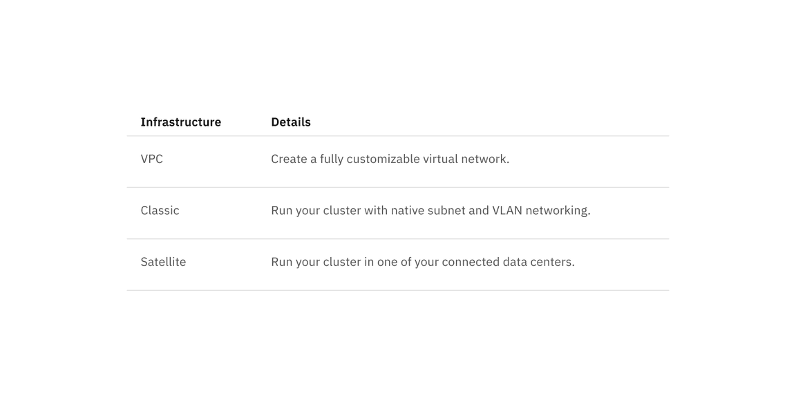
Default structured list transparent background
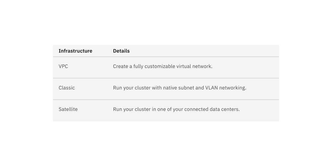
Default structured list background color option
Selectable strcutured list color
Selectable structured list has an available feature flag.
| Element | Property | Color token |
|---|---|---|
| Header | background-color | transparent |
| background-color |
| |
| Header: text | text color |
|
| Row | background-color | transparent |
| background-color |
| |
| Row: text | text color |
|
| Divider | border-bottom |
|
| Icon | svg |
|
- Denotes a contextual color token that will change values based on the layer it is placed on.


Selectable structured list background color option with a feature flag
Selectable structured list interactive color
| State | Element | Proptery | Color token |
|---|---|---|---|
| Enabled (selected) | Row | background-color |
|
| Row: text | text color |
| |
| Hover | Row | background-color |
|
| Row: text | text color |
| |
| Hover (selected) | Row | background-color |
|
| Row: text | text color |
| |
| Focus | Row | background-color | transparent |
| Row | background-color |
| |
| Border | border |
| |
| Focus (selected) | Row | background-color |
|
| Row: text | text color |
| |
| Border | border |
| |
| Disabled | Row | background-color | transparent |
| Row | background-color |
| |
| Row: text | text color |
| |
| Icon | svg |
| |
| Disabled (selected) | Row | background-color |
|
| Row: text | text color |
| |
| Icon | svg |
|
- Denotes a contextual color token that will change values based on the layer it is placed on.
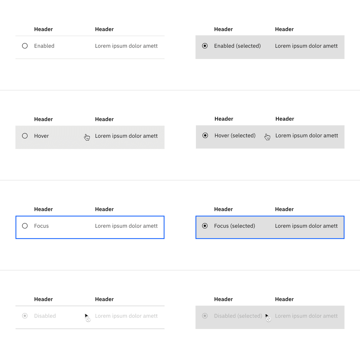
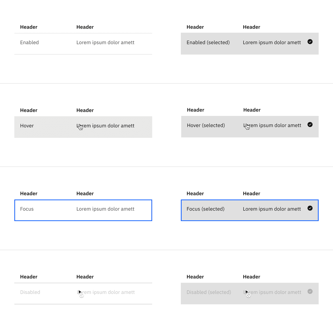
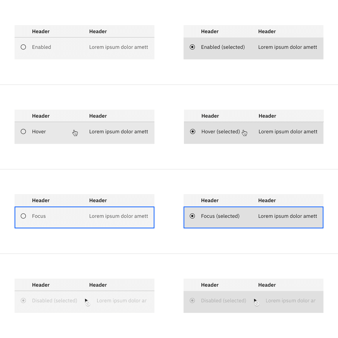
Selectable structured list interactive state background color option with a feature flag
Typography
Structured list header and row text should use sentence-case capitalization. All typography is left aligned.
| Element | Font-size (px/rem) | Font-weight | Type token |
|---|---|---|---|
| Header text | 14 / 0.875 | SemiBold / 600 |
|
| Row text | 14 / 0.875 | Regular / 400 |
|
Structure
Default structured list structure
| Element | Property | px / rem | Spacing token |
|---|---|---|---|
| Container | min-width | 500 / 31.25 | – |
| Header: text | padding-top | 16 / 1 |
|
| padding-bottom | 8 / 0.5 |
| |
| padding-right | 16 / 1 |
| |
| padding-left (hang) | 16 / 1 |
| |
| padding-left (flush) | 0 | – | |
| Row: text | padding-top | 16 / 1 |
|
| padding-bottom | 24 / 1.5 |
| |
| padding-right | 16 / 1 |
| |
| padding-left (hang) | 16 / 1 |
| |
| padding-left (flush) | 0 | – |
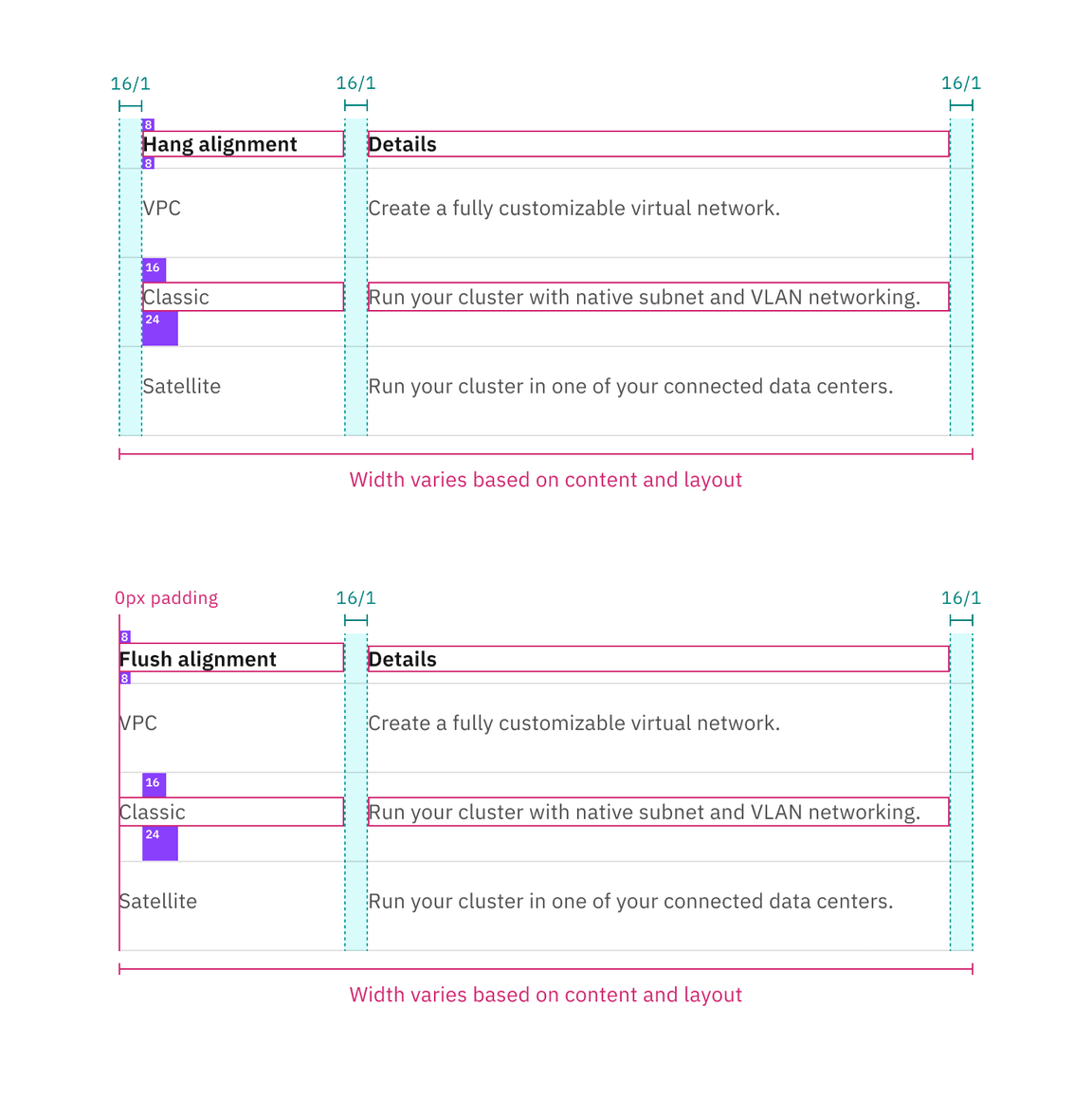
Spacing and measurements for default structured list with hang and flush alignment | px / rem.
Selectable structured list structure
| Element | Property | px / rem | Spacing token |
|---|---|---|---|
| Container | min-width | 500 / 31.25 | – |
| Header: text | padding-top | 16 / 1 |
|
| padding-bottom | 8 / 0.5 |
| |
| padding-right | 16 / 1 |
| |
| padding-left, padding-right | 16 / 1 |
| |
| Row: text | padding-top | 16 / 1 |
|
| padding-bottom | 24 / 1.5 |
| |
| padding-left, padding-right | 16 / 1 |
| |
| Icon | height, width | 16px | – |
| padding-left, padding-right | 16 / 1 |
|
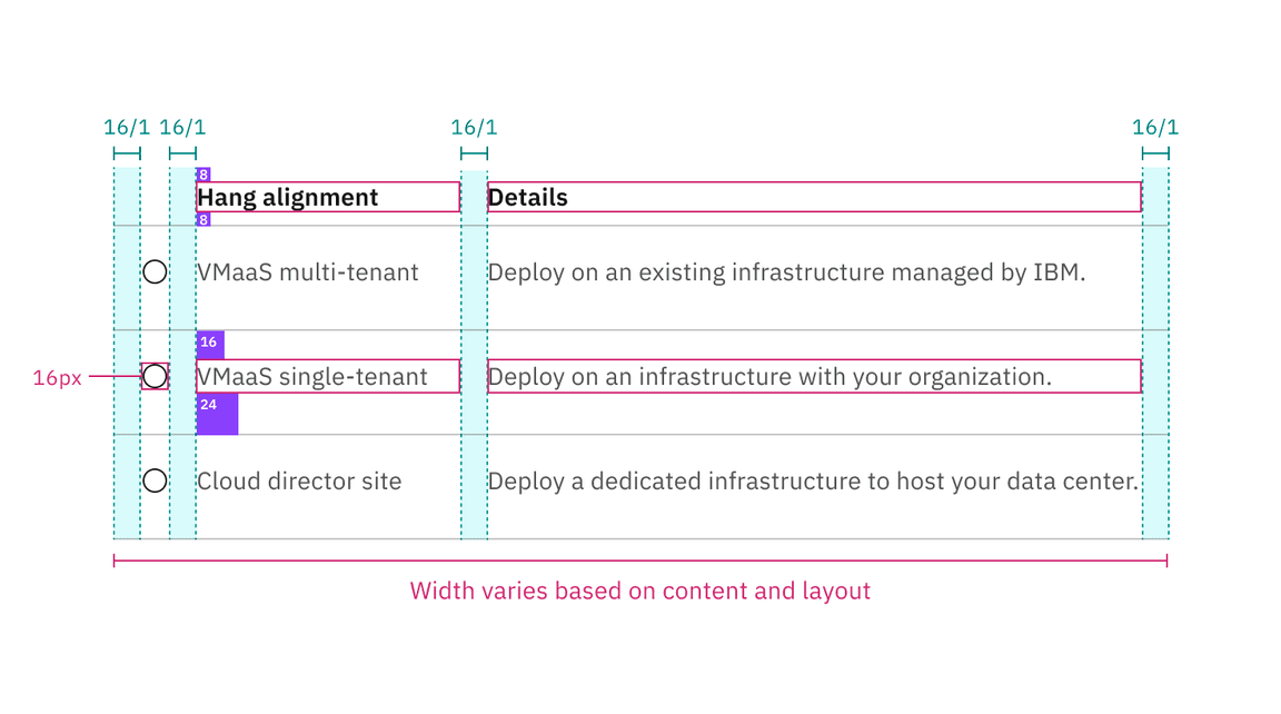
Structure and spacing measurements for selectable structured list with a feature flag | px / rem.
Size
There are two structured list height sizes: default and condensed.
| Element | Size | Height (px/rem) |
|---|---|---|
| Row | Default | 60 / 3.75 |
| Condensed | 36 / 2.25 |
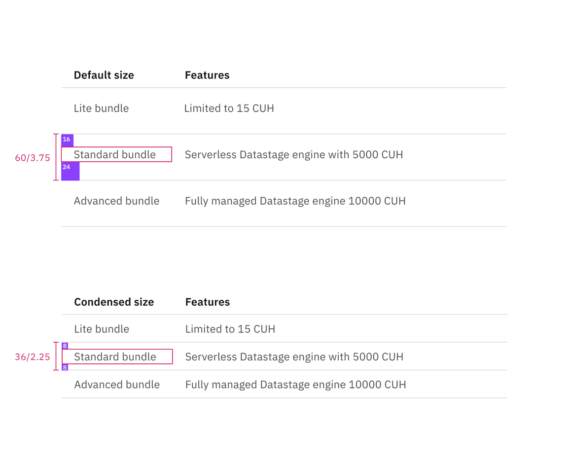
Structured list sizes | px / rem
Feedback
Help us improve this component by providing feedback, asking questions, and leaving any other comments on GitHub.